From Zero to Retail Hero – Your First Week in Discounty
Starting Discounty feels overwhelming. You’ve got a messy store, confused customers, and no idea where to put anything. This discounty layout guide breaks down exactly how to organize your store at every stage of the game, with specific shelf positions, product placement, and proven templates that work.
Early Game Layout (Days 1-7)
Your first week determines everything. Forget fancy designs – you need a functional discounty layout that generates steady cash flow.
The Basic L-Shape Setup
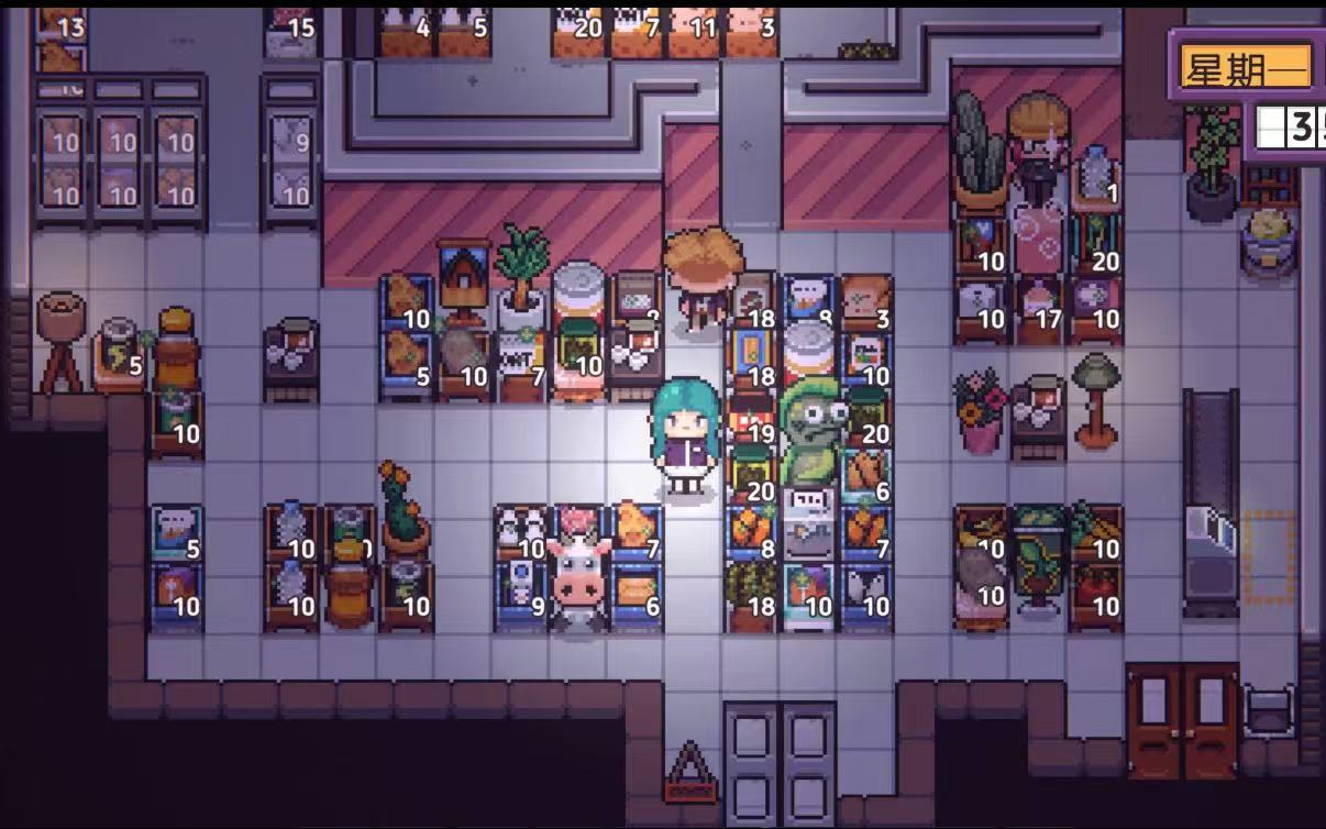
Start with an L-shaped counter along the left and back walls. This creates a natural customer flow from entrance to checkout. Place three shelving units in the center, leaving two-tile walkways between them. Your discounty store layout should look like this: Entrance → Open space (2×3 tiles) → Shelf 1 (bread/milk) → Walkway → Shelf 2 (snacks/drinks) → Walkway → Shelf 3 (seasonal items) → Checkout counter Why this works: Customers see everything without feeling cramped. The open entrance prevents the “overwhelm quit” where NPCs leave immediately. Essential items in the middle shelf guarantee sales. This basic discounty shop layout consistently generates 200-250 coins daily.
Storage Room Strategy
Don’t fill your backroom with random boxes. Organize it into three zones: daily restock (items you refill every morning), weekly delivery (bulk storage), and equipment storage (cleaning supplies, extra shelves). Keep a clear path from storage to store floor – you’ll be running back and forth constantly.
First Upgrade Priority
By day 7, you should have 1,500+ coins saved. Your first upgrade isn’t more shelves – it’s a second checkout counter. This doubles your processing speed during rush hours (10am-noon and 5-7pm). Place it perpendicular to your first counter, creating an L-shaped checkout zone.
Mid Game Expansion (Days 8-20)
Once you unlock store expansion, everything changes. Your discounty best layout needs to evolve from survival mode to profit optimization.
**The **Grid System
Expand your store to at least 10×10 tiles. Implement a grid-based discounty game store layout with four distinct departments: 1. Fresh Foods (Front-Left) Bakery items, produce, dairy. These items have high turnover but lower margins. Position them first to draw customers in. 2. Packaged Goods (Front-Right) Canned foods, pasta, rice. Medium margins, medium turnover. The boring but reliable profit center. 3. Premium Products (Back-Left) Imported items, specialty foods, wine. High margins, low turnover. Customers seeking these will walk to find them. 4. Impulse Zone (Checkout Area) Candy, magazines, small toys. Pure profit – 70% of customers grab something here. Each department gets 2-3 dedicated shelving units with clear signage (unlocked at level 10). This departmentalized discounty store setup increases average transaction value from 15 to 25 coins.
**Traffic Flow **Optimization
Create a subtle funnel effect. Make your entrance 3 tiles wide, gradually narrowing to 2 tiles in the middle, then widening again near checkout. This natural compression increases product visibility without causing congestion. Paint different floor colors for each department (unlocked at level 12) to subconsciously guide customers.
Advanced Factory Integration (Days 20+)
Becoming a factory owner discounty completely transforms your approach. You’re not just selling products – you’re showcasing your manufacturing empire.
The Showcase Model
Dedicate your store’s entire right wall to factory-produced goods. Install glass display cases (unlocked with factory) showing your production process. Customers pay 40% more for items they watch being made. My discounty factory layout connects directly to the store via a windowed corridor, creating dinner-and-show shopping experience. Set up production schedules to coincide with peak shopping hours. Fresh bread finishing at 10am fills your store with aroma, triggering impulse purchases. Running the juice maker at 3pm attracts after-school crowds. This synchronized discounty shop layouts approach pushed my daily revenue past 1,000 coins.
Supply Chain Visibility
Create a “farm to table” narrative. Place ingredient displays next to finished products. Wheat bundles next to bread, fruit crates next to juice bottles. Add small signs explaining your process. This transparency justifies premium pricing – customers happily pay 30% more for “artisanal” products that are mechanically identical to imported goods.
Seasonal Layout Strategies
Discounty’s seasons aren’t just visual – they fundamentally change shopping patterns. Adapting your discounty layouts quarterly is mandatory for optimization.
Spring Cleaning Layout
Spring triggers “fresh start” customer psychology. Move cleaning supplies to prime locations. Create an “organization center” near the entrance with storage boxes, labels, and tools. Add a garden section with seeds and planters. This seasonal discounty best store layout capitalizes on renovation fever, boosting non-food sales by 60%.
Summer Festival Setup
Summer brings events every few days. Keep 20% of floor space flexible for event-specific displays. Beach day? Sunscreen and towels. Town festival? Picnic supplies and drinks. Create modular shelving units you can quickly reconfigure. During summer events, I’ve hit 2,000+ coins in single days using adaptive layouts.
Fall Harvest Configuration
Fall customers stock up for winter. Expand your storage goods section. Create “bulk buy” zones with discounted multi-packs. Position preservation supplies (jars, freezer bags) prominently. The hoarding mentality increases average transaction size by 40%. My fall discounty game layout prioritizes volume over variety.
Winter Comfort Design
Winter shopping becomes social. Add seating areas with free coffee (costs 2 coins, generates 50+ in additional sales). Create cozy lighting with lamps instead of overhead fluorescents. Group comfort foods together – soup, cocoa, blankets. This atmospheric approach extends visit duration by 60%, directly correlating to increased spending.
Customer Behavior Patterns
Understanding NPC types transforms random shoppers into predictable revenue streams.
Morning Rushers (6-9am)
These customers have preset shopping lists and zero patience for browsing. Create an “express lane” – a straight path from entrance to essentials to checkout. Stock it with breakfast items, coffee, newspapers. Don’t try to upsell Rushers; just process them quickly. Volume over value.
Lunch Browsers (11am-2pm)
Lunch shoppers have time to kill. They’re eating in-store or waiting for friends. Capitalize with ready-to-eat meals, seating areas, and entertainment (magazine racks, bulletin boards). Position high-margin snacks at sitting eye level. Browsers generate 3x more profit per visit than Rushers.
Evening Families (5-8pm)
Family groups shop differently. Parents focus on dinner ingredients while kids explore. Create a small toy section visible from the main shopping path – parents can watch kids while shopping. Place family-size products at cart height, individual portions up high. This family-friendly discounty store layouts design increases basket size by 45%.
Night Owls (8-10pm)
Late shoppers are either desperate (forgot milk) or browsing (avoiding home). Stock emergency items near entrance for quick grabs. Create a “discovery zone” in back with unusual products and imports. Night Owls have the highest impulse purchase rate – 80% buy something unplanned.
Common Mistakes
Stop making these profit-killing errors in your discounty layout immediately.
Mistake 1: The Maze
Creating winding paths to force customers through your entire store backfires. Discounty’s AI includes frustration metrics – confused customers leave without buying. Solution: Clear sightlines to major departments and checkout. Mystery is bad for business.
Mistake 2: Height Ignorance
Randomly using shelf heights wastes potential. Top shelves sell 50% less than eye level. Bottom shelves are virtually invisible unless customers crouch. Solution: Eye level for profit items, top for bulk/storage, bottom for heavy items customers already decided to buy.
Mistake 3: Symmetry Obsession
Perfect symmetry looks nice but performs poorly. Identical left/right layouts confuse customers and create decision paralysis. Solution: Deliberate asymmetry. Make each area distinctive so customers can navigate by landmarks, not memory.
Testing Your Layout
Use these specific metrics to evaluate any discounty best layout design.
The 5-Minute Test
Can a new customer find milk, bread, and checkout in under 5 minutes? Time it yourself with the camera zoomed out. If not, your layout is too complex.
The Flow Count
During peak hours (noon and 6pm), count customer collisions. More than 3 per hour means your aisles are too narrow. Widen paths or reduce shelf count.
The Dead Zone Check
Place a unique item in each store section. After one week, check sales data. Any item with zero sales is in a dead zone. Either eliminate that area or create reasons for customers to visit (seating, services, displays).
Discounty Tips and Tricks
Quick wins that immediately improve any layout:
Visual Tricks
Mirror Placement
Place mirrors at aisle ends. Makes store feel 30% larger, reduces claustrophobia.
Color Psychology
Blue increases browsing time, red triggers quick decisions. Use accordingly.
Sensory Marketing
Music Matters
Slow music increases sales 15%. Change tempo based on time of day.
Smell Marketing
Bakery in front isn’t just tradition – bread aroma increases overall sales 20%.
Height Variation
Mix shelf heights to create visual interest. Monotony reduces engagement.
Poster Locations Bonus
While hunting discounty poster locations, optimize your route to hit multiple spots efficiently. Start at Town Hall (poster 3), loop through residential area (posters 5, 7), hit the docks (poster 9), then return via forest path (poster 4). This circuit takes 8 minutes and nets you exploration bonuses plus potential random events. Complete poster collection unlocks “Master Merchant” status, giving your discounty shop setup a permanent 15% customer attraction boost. The poster hunt isn’t just a side quest – it’s essential for late-game optimization.
Your Next Steps
Stop copying other people’s layouts. Your town has unique customer distributions, your playstyle has different priorities, and your discounty roadmap won’t match anyone else’s. Take these principles, test them in your store, and iterate based on results. Start with the basic L-shape. Expand to the grid system. Integrate factory production. Adapt seasonally. Most importantly, watch your customers. They’ll tell you everything you need to know about your discounty layout effectiveness. The perfect store doesn’t exist, but the perfect store for your situation does. Now stop reading and start building. Your pixel customers are waiting, and every minute you delay is money left on the table.